Building with AI: Upvest's external dashboard

Experimenting with Hyperagent to build a dashboard MVP
Built with AI
Back-Office DashboardNavigation designUI componentsWeb (Desktop)Overview
Upvest is an investment API infrastructure used by big FinTech names like Revolut, N26, SumUp, Shares, etc. The external dashboard aka External Service Panel (ESP) aka UpFront, was built for the customers of Upvest. To manage and monitor the data being processed by the Upvest Investment API.
Having built the foundations for this external dashboard losely based on the traditional design process in 2024-2025, this is my documentation of my learnings in talking to AI (Hyperagent) to generate screens and functionalities of UpFront.

Design in early 2025
The took shape in Q4 2024 as an initiative, and a new team was formed at the start of 2025. Early 2025, was when the the developers were being hired. And along with the product lead, Christian, I led the design side of things for the client-facing, self-service dashboard.
For more details on how the interfaces were created without AI, please visit the link below for a classic design process.
Laying foundations for Upfront: Upvest's external dashboard
Creating an MVP with initial wireframes & interfaces for a client-facing dashboard to monitor user investments

Preparations for co-design
Setting up design.md
Based on learnings from multiple posts and design.md files extracted from github, I created a design.md file for Upvest's external dashboard that clearly conveys the values, intents and boundaries that are needed before generating anything with AI.
# DESIGN.md — Upvest External Service Panel

_The partner-facing console where Upvest's external clients view and manage their orders and users. Built for non-experts: every screen should be legible at a glance and safe to operate without training._

Foundations in this file are derived from the Figma source **"Ext. Service Panel"** (`n6mehNNTtvaX3KU2wE5Wbv`). Where the file contains more than one option for the same job (two neutral ramps, a glossy legacy button), this document names the single canonical choice and records the rest under **Don'ts** so generated UI stays consistent.

---

## 1. Product brief

The External Service Panel is the web console Upvest gives to **external partners and clients** — the companies that build on Upvest's investment infrastructure. Inside it they review **orders** and **users**: browsing tables, opening a record to see its details, checking status, and performing a small set of managed actions (search, filter, paginate, export, edit, invite).

These users are **not power users of this tool**. They are operations and support staff at partner firms who open the panel to answer a specific question — "did this order settle?", "is this user verified?" — and then leave. The interface must therefore:

- Make **status and outcome legible in seconds**, without the user reading documentation.
- Prefer **one obvious path** over flexible-but-complex controls.
- Never punish a mistake — destructive actions are confirmed, and nothing irreversible is one click away.

When a design decision trades power for clarity, choose clarity. This audience reads density as complexity, and complexity as risk.

---

## 2. Design principles

1. **Status is never ambiguous.** A partner must be able to tell paid from pending, verified from blocked, succeeded from failed — by reading, not by guessing. Color reinforces status; it never carries it alone.
2. **Calm by default.** Flat color, generous space, one accent. The panel should feel like a quiet instrument, not a marketing surface. Visual energy is reserved for the one thing that needs the user's attention.
3. **One primary action per screen.** Non-experts scan for "what do I do here?" There is exactly one answer, expressed as the single Royal Blue button. Everything else is secondary.
4. **Tables are the product.** Most screens are lists of orders and users. Scanning, sorting, and reading rows must be effortless before anything else is decorated.
5. **Legible over dense.** When space is in question, add it. Fewer items shown clearly beats more items shown tightly.

---

## 3. Color tokens

Format below is **value → intent → boundary**. The boundary is the part that keeps generated screens on-brand: it says where a color may _not_ go.

### Brand

```yaml
navy: "#262645"
# Primary ink. Headings, body text, icons, the dark UI surfaces (top bar, nav).
# This is the default text color on light backgrounds — reach for it before any grey.
# Never use as the primary action color (that is Royal Blue) and never as a status color.

royal-blue: "#4B64FF"
# The single interactive/brand color. Primary buttons, active nav, links, focus rings,
# selected states. Also exposed as the alias `CTA/Royal Blue` in Figma — same value.
# One primary use per screen. Never a page background, never a large fill, never decorative.
# If two things on a screen are Royal Blue and both look "primary", one of them is wrong.

royal-blue-hover: "#2E49E5"
# Hover/pressed state for Royal Blue interactive elements only. Not an independent color.

pale-blue: "#E8F1F4"
# Brand surface tint. Page background behind cards, hovered table rows, quiet section fills.
# A background only — never put text directly in this color, never use it to signal status.

white: "#FFFFFF"
# Card and table surfaces, text on dark (navy) surfaces.

navy-200: "#DCE3FC" # Subtle selected/hover fill for navy-family chips and nav.
navy-300: "#C6CCF7" # Light navy border / divider on tinted surfaces, focus halo.
# Both are quiet structural tints. Never used for text.

accent-yellow: "#FFE27A"
# Sparing brand highlight (e.g. a "new" flag, a single emphasized metric). Decorative only.
# This is NOT a warning color. Do not use it to communicate caution — that is `warning` below.
```

### Neutrals (canonical ramp)

```yaml
grey-900: "#28282F" # Highest-contrast text when navy is too saturated (rare).
grey-800: "#3E3E47" # Strong secondary headings, emphasized table values.
grey-600: "#71717D" # Secondary text: timestamps, helper copy, column sublabels.
grey-500: "#91929E" # Placeholder text, disabled labels, non-actionable icons.
grey-200: "#E2E3E8" # Default borders, dividers, table gridlines, input outlines.
grey-100: "#EFF0F3" # Subtle fills: zebra rows, disabled button backgrounds, skeletons.
# Text hierarchy is navy (primary) → grey-600 (secondary) → grey-500 (muted). Three levels, no more.
# Borders are grey-200 by default. Reach for a darker border only to show focus or error,
# and in those cases use Royal Blue or the error color, never a darker grey.
```

### Status (reserved — see Don'ts)

```yaml
success: "#008763" # Text & icons for positive states: paid, settled, verified, active.
success-subtle: "#ECFDF3" # Background tint behind success content (badge fill, banner).

warning: "#B54708" # Text & icons for caution states: pending review, action required.
warning-subtle: "#FFFAEB" # Background tint behind warning content.

error: "#B42318" # Text & icons for negative states: failed, rejected, blocked, overdue.
error-subtle: "#FFDCD3" # Background tint behind error content.
# These six values are the ENTIRE status vocabulary. One hue per state.
# Using any of them decoratively — a green divider, a red label that isn't an error — trains
# partners to stop trusting the color as a signal. That is the most damaging thing this UI can do.
# The Figma file also contains near-duplicates (Coral/500 #E56D55, Green/500 #03A57A). Do not
# introduce them as second "success"/"error" colors; collapse to the values above.
```

---

## 4. Typography

The panel uses **two typefaces with non-overlapping jobs**. Keep the pairing fixed — never swap them per screen, never add a third.

- **NC Fontina** — the licensed Upvest brand text face. Everything the partner _reads as content_: body copy, form labels, link text, table cell values, record details. Loaded with a fallback stack of `"NC Fontina", "Inter", system-ui, sans-serif` (NC Fontina is licensed, not a web-default — ship the font files; Inter is the loading fallback).
- **Inter** — the UI scaffold face. Headings, page titles, large metrics and numerals, and dense system chrome. Inter's tighter tracking is tuned for these. Stack: `"Inter", system-ui, sans-serif`.

```yaml
# HEADINGS — Inter
display:
  size: 35px / line: 40px / weight: 500 / tracking: -0.0046em
  usage: One per page maximum — the page title or a hero metric. Never inside a card or table.
h1:
  size: 28px / line: 36px / weight: 500 / tracking: -0.0043em
  usage: Section/screen title. Never used as actionable text.
h2:
  size: 24px / line: 30px / weight: 500–700
  usage: Card titles, modal titles, major groupings.
h3:
  size: 20px / line: 28px / weight: 500–700
  usage: Sub-sections, detail-panel headers.
h4:
  size: 16px / line: 24px / weight: 600
  usage: Smallest heading. Table group headers, dense panel labels.

# CONTENT — NC Fontina
body-m:
  size: 16px / line: 24px / weight: 400 / tracking: 0.01em
  usage: Default body and table cell text. The reading default.
body-s:
  size: 14px / line: 16px / weight: 400 / tracking: 0.01em
  usage: Secondary/dense content, compact table rows, helper text.
label-m:
  size: 16px / line: 24px / weight: 400
  usage: Form field labels at comfortable density.
label-s:
  size: 14px / line: 16px / weight: 400 / tracking: 0.01em
  usage: The workhorse label — input labels, column headers, badge text, tags.
label-xs:
  size: 13px / line: 16px / weight: 400 / tracking: 0.02em
  usage: Smallest label. Metadata, table sublabels. Never use for anything clickable — too small to tap.
link:
  size: 14–16px / weight: 400 / tracking: 0.01em / color: royal-blue
  usage: Standalone links. Underline or color shift on hover; never rely on color alone (see Don'ts).
```

Decision logic: if the text is a **title or a number the eye lands on**, it is Inter. If it is **something the partner reads to understand a record**, it is NC Fontina. Headings never appear inside table cells; `label-xs` never carries an action.

---

## 5. Spacing

Base unit **4px**. Use the scale; avoid off-scale values.

```yaml
space: [4, 8, 12, 16, 24, 32] # 48 reserved for major page-level separation only
```

- `4 / 8` — inside compact elements (badge padding, icon-to-label gaps, chip internals).
- `12` — the most common gap: between a label and its field, between stacked rows, button label-to-icon.
- `16` — default padding inside cards, inputs, and table cells; gap between sibling controls.
- `24` — card and section padding, gap between distinct content blocks; modal body padding.
- `32 / 48` — separation between major page regions.

**Philosophy:** when in doubt, add space. For this non-expert audience, density reads as stress and stress reads as risk. A screen that feels a little empty is correct; a screen that feels busy is a bug. Default control height is **40px** — comfortable to read and to click, never compressed below it for visual tightness.

---

## 6. Components

Specs are real values from the source file. What matters more than the numbers is the **decision logic** — when to reach for each component.

### Buttons

Three levels, and the hierarchy is the whole point:

- **Primary** — solid Royal Blue (`#4B64FF`), white label, radius 8px, height 40px, padding 8×16. This is the one action the screen exists for. **One per screen.** If you want a second primary button, the screen is doing two jobs — split it or demote one to secondary.
- **Secondary** — white surface, `grey-200` border, navy label. Supporting actions that share the screen with the primary (Cancel, Export, Filter).
- **Tertiary / link button** — no border, Royal Blue label. Low-stakes inline actions (Edit, View, Copy).

Buttons are **flat fills only**. The Figma library carries a legacy "button-classic" treatment (a blue gradient plus an inset-highlight glossy shadow) — **do not use it.** It violates the flat-color rule and reads as a different product. A button is a solid rectangle of color, nothing more.

Destructive actions (delete, revoke, block) use a secondary button with `error` label and border — never a solid red primary that invites an accidental click.

### Cards vs. table rows

This panel is table-first, so the default is almost always a table:

- Use a **table** when the partner is scanning many records of the same shape to find or compare — the Orders and Users lists. Columns align values for fast vertical scanning; status lives in a badge in a dedicated column.
- Use **cards** only for a small set of unlike, browsable objects (e.g. a dashboard of summary tiles), where each item is chosen rather than scanned.
- When unsure: if the user reads down a column, it's a table. If they pick one tile out of a few, it's a card.

Cards: white surface, `grey-200` border, radius 16px for large containers (8px for small ones), padding 24px, optional `Shadow/xs` (`0 1px 2px rgba(16,24,40,0.05)`). Shadows stay at the `xs` level — this is a flat UI; elevation is a whisper, not a lift.

### Tables

The core surface. Rows are separated by `grey-200` gridlines, not heavy fills; an optional `grey-100` zebra or `pale-blue` hover is the only row background. Header cells use `label-s` in `grey-600`. Cell content is `body-s`/`body-m` in navy. Keep row height comfortable (≥40px of content box) — never compress rows to fit more on screen. Status always appears as a **badge**, never as colored cell text alone. Pagination sits below the table; show the current range and total so the partner always knows where they are.

### Status badges, pills & dots

This is where the reserved status palette does its work. A badge is `label-s` text on a `*-subtle` background with the matching solid color for text/icon, pill-shaped (fully rounded) or radius 6px. Pattern: a colored **dot + word** ("● Paid", "● Failed") so the meaning survives even if the color is missed. **Never a bare colored dot with no label** for anything a partner must act on. Map states to exactly one family: positive → success, in-progress/needs-attention → warning, negative/failed → error. Neutral/informational states (e.g. "Draft") use `grey-100` background with `grey-600` text — grey is the "no status" status.

### Forms (text field, select, dropdown, checkbox)

Label sits **above** the field (`label-s`), never as placeholder-only — placeholders disappear and strand non-experts. Field: white surface, `grey-200` border, radius 8px, height 40px, padding ~10×16. Focus: Royal Blue border + halo. **Error state is always icon + text message + color, never color alone** — a red border with no explanation is useless to this audience. Disabled: `grey-100` fill, `grey-500` text. Selects and dropdowns follow the same frame; the open list uses the same surface, radius, and `Shadow/xs`.

### Tabs vs. segmented control

- **Tabs** switch between _views of different content_ (e.g. "Orders" / "Users" / "Settings"). Underline or filled active state in Royal Blue.
- **Segmented control** filters _one dataset into mutually exclusive subsets_ (e.g. "All / Pending / Settled"). Use it when the options are few, fixed, and naturally exclusive.
- More than ~5 options, or options that grow over time → use a dropdown filter, not either control.

### Modals & drawers

Reserve modals for **focused, interrupting tasks**: confirming a destructive action, or a short form. White surface, radius 16px, padding 24px, title in `h2`/`h3`, one primary + one secondary button. Confirmation modals state the consequence in plain language and name the object ("Revoke access for jane@partner.co?"). For viewing a record's details without leaving the list, prefer a **side drawer** over a modal — it preserves the partner's place in the table. Never stack modals.

### Links, avatars, description lists, nav

- **Links** are Royal Blue with a non-color affordance (underline on hover or persistent underline in body copy).
- **Avatars** identify users in tables and detail headers; pair with the name, never alone as the only identifier.
- **Description lists** (term / definition pairs) are the pattern for record detail panels — a quiet two-column read of "Field → Value", `label-s` grey term over `body-m` navy value.
- **Nav items** mark the active destination with Royal Blue (text + indicator). One active item at a time.

---

## 7. Don'ts

```
- No gradients anywhere — buttons, backgrounds, badges, icons. Flat color only. This explicitly
  retires the legacy "button-classic" gradient + glossy inset-shadow button style in the Figma file.
- Status colors (success green, warning amber, error red) are reserved for status. Never decorative,
  never a divider, never a brand accent. One hue per state — do not add Coral/Green near-duplicates.
- Accent Yellow is a highlight, not a warning. Never use it to signal caution.
- No more than one primary (Royal Blue) action per screen.
- Error and validation states are always icon + text + color. Color alone is never the message.
- No status communicated by a bare color swatch or dot without a text label.
- One neutral ramp only. The file currently carries two (brand Grey/Grey-* and imported Untitled-UI
  Gray/*) — use the canonical grey ramp in §3 and retire the Gray/* set. Do not invent new greys.
- Two typefaces only, with fixed roles: Inter for headings/metrics, NC Fontina for content. Never a third.
- No elevation beyond Shadow/xs. This is a flat UI; cards sit on the page, they don't float above it.
- Never compress row height or padding below the scale to fit more on screen. Density is not a feature here.
- No placeholder-only form fields. Every input has a visible label above it.
- Don't put headings (Inter display/h1–h4) inside table cells or use label-xs for anything clickable.
- No motion on tables, rows, or status changes — movement on data reads as instability to this audience.
```

---

## 8. Diagnostic loop (recommended)

Treat this file as testable, not final. Drop it into your AI coding tool (Claude Code, Cursor, Stitch) and ask for **three variations of the Orders table screen with a row detail drawer** — the panel's most complex core surface. Don't judge whether it looks nice; watch **where the three variations disagree**. Every divergence is a constraint this file hasn't stated yet — a spacing it didn't pin, a status mapping it left open. Add the missing rule and run again. Most DESIGN.md files stabilize after two or three loops, and the model's mistakes tell you exactly what to write next.
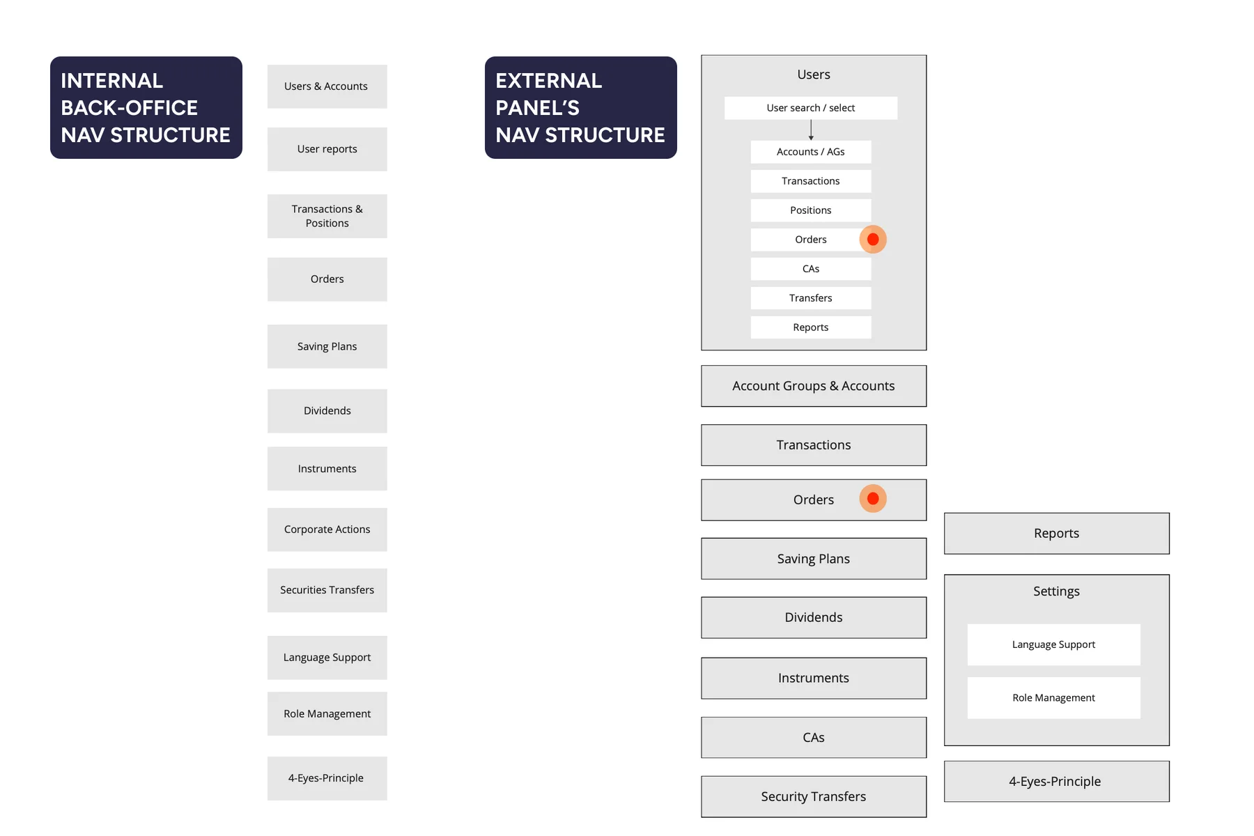
Structuring the navigation
With entities and modules inspired from the internal back-office, I had done a card sorting exercise on Miro which I also fed to the AI to construct the main user navigation.

Providing a reference
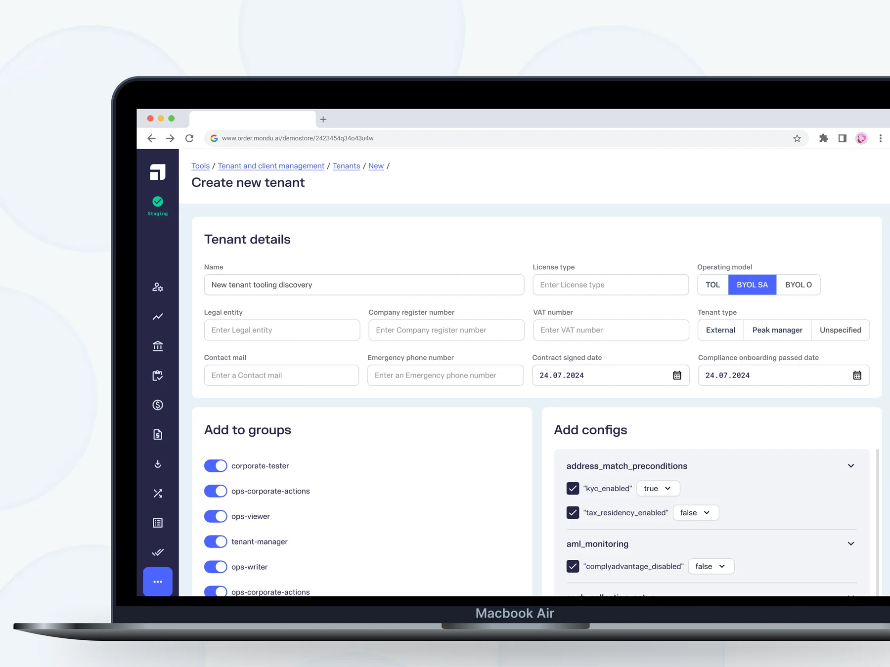
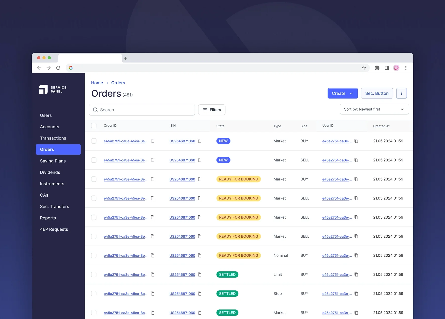
With an understanding of the product and it's existing components from the back-office, that were going to be reused, I had created a high-fidelity screen as reference that was fed into the AI tool.

Designing with AI
Armed with the design.md file and with the reference image, I set out to get the AI to carry out some basic tasks, like creating the interfaces for Users and Orders.
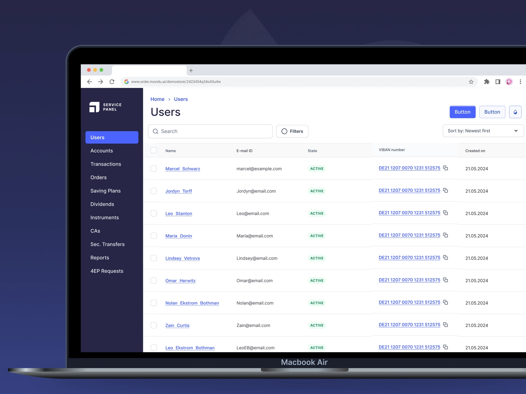
User Details Page
Based on the prompt I provided, the AI agent asked me a few straight-forward follow-ups like the one highlighted below.
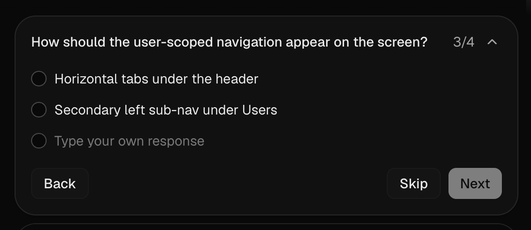
And having thought these through already, it was quick and easy to decide what needed to be done. After answering the questions and prompting to remove the horizontal scroll-bar and some changes to the anchor links, AI generated this perfectly adequate prototype:
Having used lesser tokens in concluding that Horizontal tabs under the header is the efficient option for clutter-reduction, I proceeded to generate some more screens.
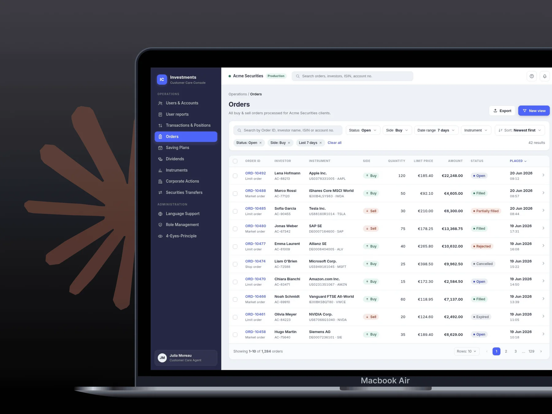
Orders and Order Details Page

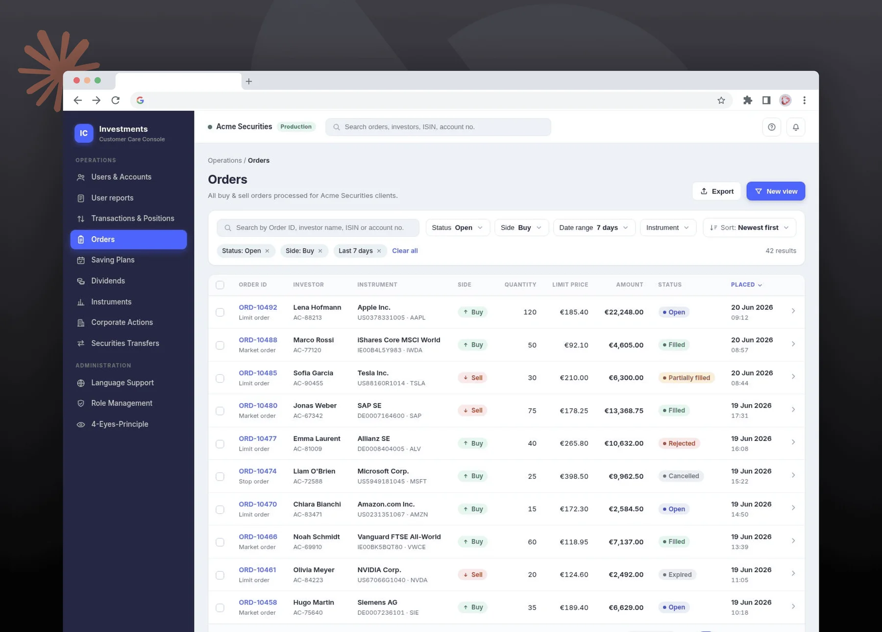

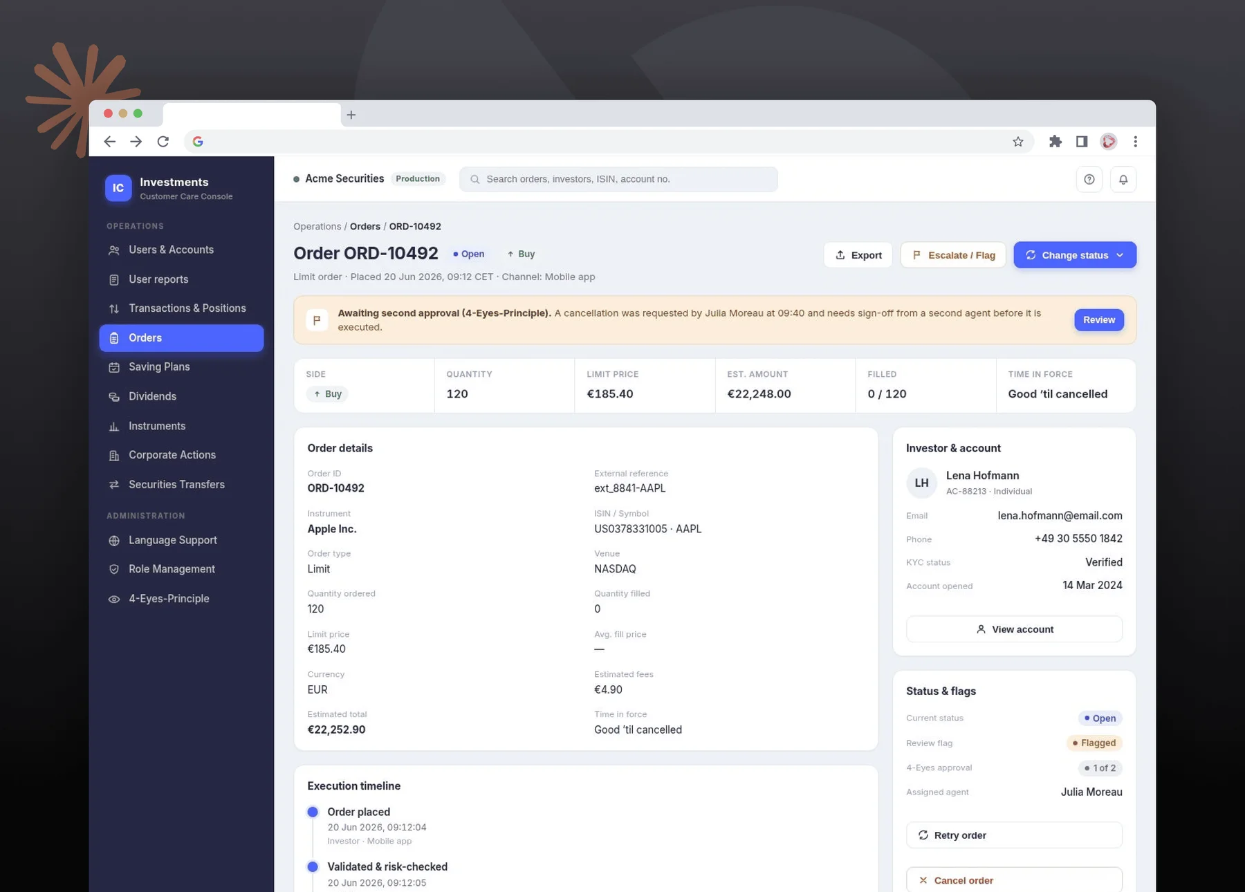
First glance looks impressive as expected, neat interface looks polished and not broken and the table looks a bit tight but not too cluttered.
Creating a prototype
There may be a few things I'd like to change, but at this MVP stage what we needed more importantly was a prototype. A clickable prototype to show our potential clients the dashboard, and inquire about the actions they might primarily need in the MVP.
So I set out to create a prototype, and chose the Create a Sell Order user flow. I fed the AI the button dropdown reference and answered some clarifying questions and...
..."Viola! A prototype!"
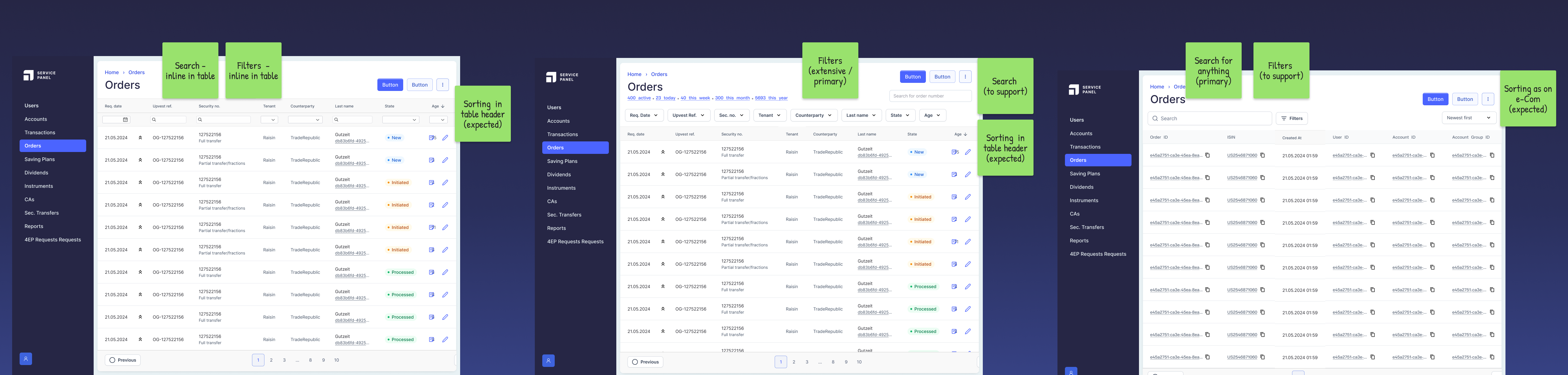
Search, Filter and Sort
For any dashboard or table-heavy interface that deals with a lot of data, it is essential to enable the user with a functional search, filter and sort. And it was important to include it as early in the MVP as possible.
To test AI's boundaries, I wanted to experiment with the breadth of solutions that AI can generate. To test this, I fed AI the options I had come up with in early 2025, and asked it to generate 3 additional solutions.
This would truly need expertise with existing mental-models and real user experience know-how.
Additional solutions proposed by Claude
I asked for 3 solutions outside of mine, and here's what I got:


Outcomes & Takeaways
Prototyping
The key outcome from this exercise was, to me, the prototype. To be able to generate clickable prototypes, that closely resemble the product, in just a few minutes is a definite blessing. MVPs and user tests can move at lightning speed and designers won't have to create spider webs on Figma anymore.
UI Design
With an effective design.md file and one reference screen, AI was able to generate a pleasant UI, apt icons, and a decent hierarchy in typography and page structure. With minimal changes added to the design.md file, the interface can be made even better with the right amount of human assistance.
UX Design
With a clearly mentioned product brief in the design.md file, some parts of the user experience can be trusted with AI.
The UX of the prototype with the "light" trainer in the bottom and the options to fill in sample data because there were multiple text-fields, gives me additional hope for AI to be the perfect design assistant.
The sparse clarifying questions are spot-on and feels like a PM and a junior designer combined. So no designer is ever solo anymore, unless they truly want to work in a silo.
However, creative solutions and mental-models are some things that are clearly missing at this point.
A human would still be needed to bring about thinking and creativity to the product, prioritize problems, and solve for human users.
Integrations like Mobbin MCP could still solve for mental-models and UI-patterns in the future.
Conclusion
I enjoyed parrying with AI and strongly believe that,
A shared design process...
...can provide well-rounded solutions - because together, the designer and AI can solve for most if not all potential problems
...is more efficient - with the designer's knowledge and the AI's speed
...is token-saving - with reference images and clarity with the process
...can allow for high-confidence solutions, based on the human skill guardrailing the AI
Next project
Automations for a streamlined client creation process
Increasing efficiency by reducing time & effort in client onboarding
B2BBack-OfficeDashboardWeb (Desktop)
Read more